


A model can finish running in seconds. Understanding what it is telling you can take much longer.
A fit statistic signals how well a model performs. A residual plot reveals whether assumptions hold. A decision tree shows how observations are split into groups. But before any of that can support a decision, someone has to connect the pieces.
What matters most? How confident should we be? Is there a pattern that needs attention? And what should we try next?
Throughout this series, we’ve followed the analytics experience from exploration and visualization to conversational and purpose-built analytics. The next step goes deeper: into the statistical model itself.
Understanding a dashboard and understanding a model are different challenges. A model can surface dozens of statistical outputs, each carrying information about performance, assumptions and potential problems. The challenge is to connect those signals and decide what deserves attention next.
SAS® Visual Statistics adds GenAI assistance to the modeling experience in SAS® Visual Analytics. The experience is centered on two closely connected needs:
- Understanding a model through AI-generated model summaries.
- Improving a model through AI-generated diagnostics and remediation.
Together, these capabilities help shorten the distance between building a model, understanding its behavior and deciding how to refine it.
Start with the story the model is telling
Statistical models can produce a lot of information: fit statistics, parameter estimates, variable importance, assessment results, residuals, influence measures and more. Each output is useful, but interpreting all of them together takes time and expertise.
Generated model summaries provide a clearer starting point. Rather than summarizing a dashboard or answering a general question about the data, the GenAI experience works directly from the model’s analytical results.
A user can request a natural-language explanation that connects the statistical evidence already produced by SAS Visual Statistics.
The summary does more than restate a single number. It connects multiple outputs and highlights the broader story: how the model is performing, which inputs matter, where the model appears strong and where closer review may be warranted.
The experience spans linear regression, generalized linear models, logistic regression and decision trees. The content adapts to the model rather than forcing every model into the same explanation.
For a linear regression, for example, users can move among focused views for the overall analysis, fit summary, residuals, assessment, influence and detailed results. This makes it possible to begin with a concise overview and then explore the statistical evidence in more depth.
A decision tree requires a different kind of explanation. Its generated summary can organize the results into overall, tree, variable importance, assessment and detailed analyses. Instead of asking a user to interpret every branch, leaf and chart independently, the summary brings those pieces together.
For example, a tree summary might identify the variables driving the model, explain the rule path behind an important leaf and describe how predicted and observed results compare across the assessment data. That is especially useful when a tree is technically easy to visualize but difficult to summarize accurately for someone who did not build it.

This is not about replacing the model output. The charts, statistics and model details remain available. The generated summary provides orientation – a faster way to understand what deserves attention and a clearer way to communicate the results to others.
From “What does this mean?” to “What should I try?”
Understanding a model is only part of the work. Often, the next question is how to improve it.
Consider a residual plot for a linear regression model. An experienced modeler may quickly recognize curvature, changing variance or unusual observations. Other users may see a cloud of points and know something looks wrong, but not know why it matters or how to respond.
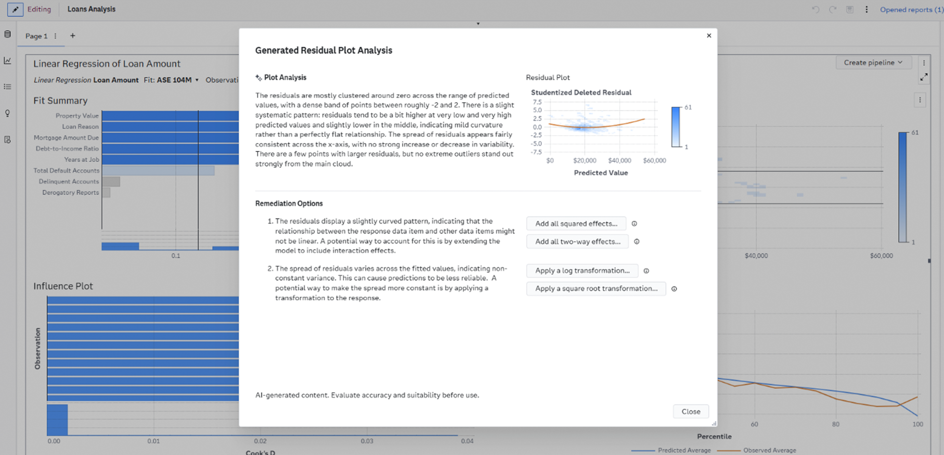
Generated model diagnostics help close that gap. From the residual plot, users can generate an analysis that describes the visible pattern in natural language and relates it to the model’s behavior. The analysis can highlight issues such as a nonlinear relationship or nonconstant variance while keeping the relevant plot alongside the explanation.
Then the experience moves from diagnosis to action. When appropriate, it offers remediation options within the same workflow. Depending on the detected pattern, those options can include adding squared effects, adding two-way interaction effects, or applying a log or square-root transformation to the response.
This moves GenAI assistance beyond explanation. It helps connect a statistical signal to a possible modeling response without requiring the user to leave the analysis, research the issue elsewhere and manually reconstruct the
The user still decides what happens next. Selecting an option opens a preview that compares the current residual plot with the proposed result. A generated explanation describes how the change affects the residual pattern, giving the user more context before applying anything to the model.
If the preview supports the analytical goal, the user can apply the change and continue. If it does not, the user can cancel and try another approach. After the model updates, the residuals can be analyzed again, creating an iterative loop of diagnosis, preview and refinement.
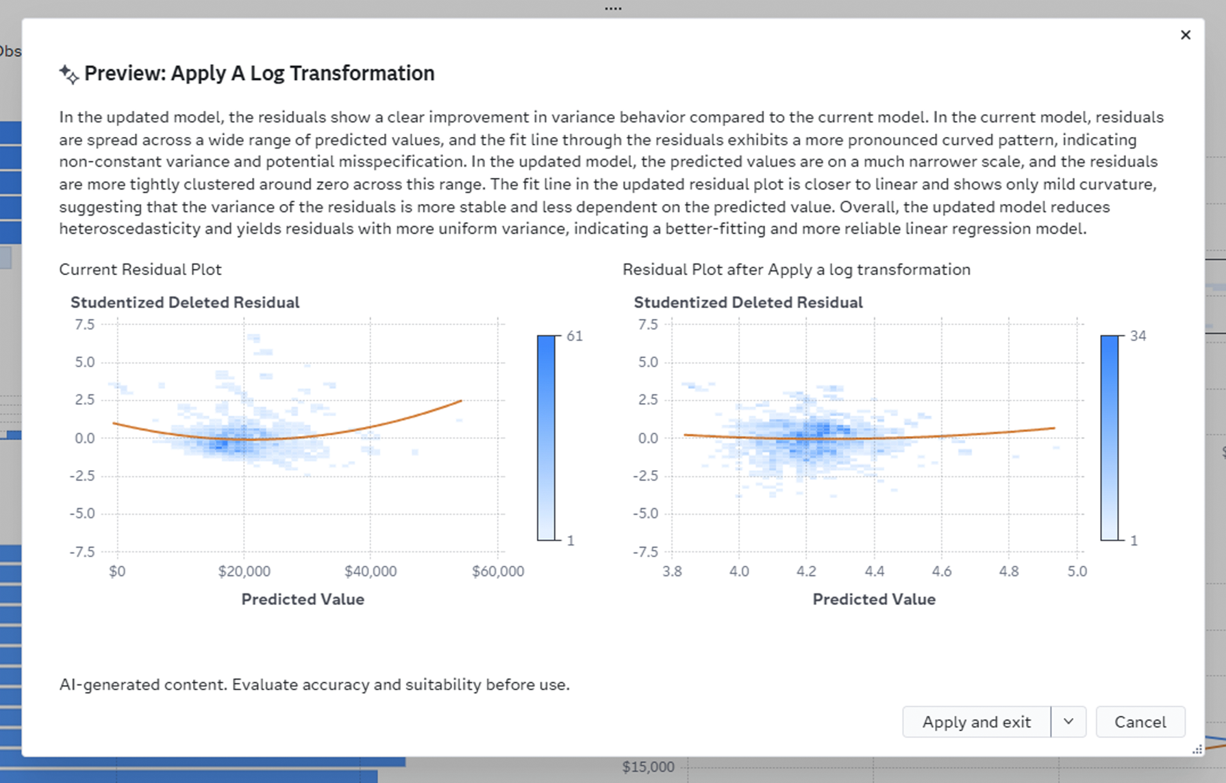
That is an important distinction. GenAI is not simply offering an answer. It is helping the user evaluate a possible next step while making the evidence visible.
Statistical judgment still belongs to the user
Modeling decisions requires context. A statistically promising change may not make sense for the business problem. A model that performs well on one sample may still require validation. And a natural-language explanation, no matter how useful, still needs to be evaluated by the person responsible for the analysis.
That is an important distinction between assistance and automation. AI-generated content is clearly identified. The underlying analytical output remains available. Remediation choices are explicit, previews are reviewable and changes are applied only when the user chooses to proceed.
GenAI contributes speed and orientation. SAS Visual Statistics contributes to the analytical computation. The user contributes domain knowledge, statistical judgment and accountability.
A shorter path from model to decision
Without embedded assistance, model interpretation can become a fragmented process: inspect several outputs, translate statistical results, research possible remedies, reconfigure the model and then compare the outcome. Every handoff creates another opportunity to lose time or context.
Generated model summaries, diagnostics and remediation bring more of that work into one continuous experience. Users can understand the model, investigate a concern, preview a response and refine the analysis without leaving the modeling workflow.
For experienced data scientists and statisticians, this can accelerate the review and iteration process. For analysts who are still building modeling expertise, it can make advanced analytics more approachable. And for business partners, generated summaries can make model behavior easier to discuss without stripping away the evidence behind the explanation.
Across this series, the analytics experience has progressively moved closer to the moment where people need help: exploring data, building reports, asking questions, designing purpose-built experiences and now interpreting statistical models.
The opportunity for GenAI in advanced analytics isn’t to make modeling disappear. It’s to make model behavior easier to understand, problems easier to investigate and potential improvements easier to evaluate.
The model still does the math. The user still makes the judgment. GenAI helps connect the two.