


Have you ever replaced fifty lines of JavaScript with a few lines of CSS, merged the PR, and felt like you just did the codebase a favor? You replace ResizeObserver with a container query, the diff is mostly red, and everyone approves it before lunch.
This was what it looked like before you made the change:
See the Pen [demo (before PR) [forked]](https://codepen.io/smashingmag/pen/XJMxVJq) by Shoyombo Gabriel Ayomide.
Then, a week later, a card on the dashboard has vanished. A heading has grown on tablets for no reason anyone can explain. The spacing inside a comment is off.
See the Pen [demo (after PR) [forked]](https://codepen.io/smashingmag/pen/gbmBopp) by Shoyombo Gabriel Ayomide.
None of these bugs are in the few lines you wrote. All of them arrived with those few lines of CSS.
In my last article on how CSS is growing smarter, I left a few questions hanging at the end, including: What happens when logic is split between CSS and JavaScript, and how do we debug conditional styles without a clear view of what triggered them? This article is my attempt to answer these two questions.
I think it’s worth saying clearly that I am not saying modern CSS is bad. What I am saying is that:
Local Simplicity Vs. System Complexity
Think of a new CSS feature as a new tenant moving into a shared apartment. The tenant may be quiet and tidy, but they still share a kitchen with everyone who already lives there. In that case, CSS is now roommates with JavaScript, the component’s layout, the CSS Cascade, and the browser’s rendering engine. The apartment’s stability depends less on the tenant and more on how they get along with one another.
That gives us two different things to measure, and a diff only shows the first one:
- Local simplicity: How little code a single file needs.
- System complexity: The number of interactions you must understand before you can safely change the application.
I am not the only one thinking about this. In April 2026, Igor Roztropiński published an essay titled “Modern Frontend Complexity: essential or accidental?” asking:
“Can we start from scratch and figure out a much simpler approach, given how browsers have evolved in recent years?”
— Igor Roztropiński
The essay landed on r/programming, where the thread has drawn 80-plus comments and the replies pull in two directions. One of the most upvoted comments, from a user named Kwantuum, pushes back on the whole genre:
“All these articles are like ‘We can do it with less!’ but then they don’t do it with less. They just do less.”
— Kwantuum
Another commenter, kayinfire, takes the other side, arguing that “there are tons of scenarios where a front-end framework introduces more accidental complexity than it’s worth.” They say this a few replies later:
“I don’t even need to go into how massively CSS has improved interactivity over the recent years, but hey nobody cares about anything apart from JS anymore, which I find to be quite a shame.”
— Keyser Söze
I think both commenters are on to something, and this article lives in the gap between the two. Yes, CSS has improved in the last several years. And yes, “less” CSS on paper is not automatically “less” complexity in practice. That said, my claim is narrower. A native feature only reduces complexity when it actually replaces what was there before and doesn’t disrupt the calm state of everything else it interacts with.
Let’s meet the housemates in our metaphorical apartment, one scenario at a time.
Scenario 1: The Behavior With Two Owners
The first housemate is JavaScript, and the trouble starts when the old tenant never quite moves out. Here is a card that switches to a two-column layout when it has enough room. The original version uses a ResizeObserver to toggle a class:
const card = document.querySelector('.card');

new ResizeObserver(([entry]) => {
  card.classList.toggle('card--wide', entry.contentRect.width > 480);
}).observe(card);
.card--wide .card__body {
  display: grid;
  grid-template-columns: 160px 1fr;
}

.card--wide .card__title {
  font-size: 1.5rem;
}
With CSS Container Queries, we need no script at all and can simplify our selectors at the same time:
.card {
  container-type: inline-size;
}

@container (width > 480px) {
  .card__body {
    display: grid;
    grid-template-columns: 160px 1fr;
  }
}
Lovely. Now, here’s the thing: migrations rarely happen in one clean sweep. The pull request adds the @container rule and removes the .card--wide .card__body rule. The observer survives because it is registered in another file. The .card--wide .card__title rule survives because nobody searched for the class. Nothing looks broken, because both implementations agree on 480px. Then a designer asks to move the breakpoint to 600px, and a developer updates the only place they know about: the @container rule.
See the Pen [Scenario 1: The Behaviour With Two Owners [forked]](https://codepen.io/smashingmag/pen/ZYeqvpx) by Shoyombo Gabriel Ayomide.
Between 480px and 600px, the card now has a single-column body and a wide-layout title. Nobody wrote that state. To find it, you need to know that the layout has two owners and read both of them.
The same trap comes in other shapes:
- JavaScript toggles an
.is-activeclass while:has()derives the very same state from the DOM. - A JavaScript animation and a CSS transition both respond to one interaction.
- Old media-query rules stay beside the new container-query rules, so the component answers to the viewport in one place and to its container in another.
CSS and JavaScript can happily share a component. What they cannot share is the component’s behavior. So, instead of having a silent fight over a component’s behavior, check first. Know all the contending parties, then split the work.
- CSS owns presentation that follows from size or DOM structure.
The layout at a given width. The appearance of a form containing an invalid field. - JavaScript owns application state and asynchronous work.
Whether a request is pending. What the server returned. Anything that code outside the stylesheet needs to read.
And when you’re done migrating, you have to finish the job: delete the observer, the class, and every selector that mentions the class. Otherwise, you may wind up with a tenant who simply refuses to move out.
Scenario 2: The Roommate Rearranges The Room
Back in 2023, I wrote about how block formatting contexts solve float issues. Back then, creating a block formatting context was something we did on purpose. Today, you can create one without meaning to. When we declare container-type: inline-size, we think we are saying, “let my children query my width.” The browser hears quite a bit more. This is the second housemate, the layout around the component, and our new tenant who just asked for one shelf has ended up rearranging the living room.
According to MDN’s container-type reference, the value “applies style and inline-size containment to the element.” And MDN’s guide to block formatting contexts lists “query containers (elements where container-type isn’t normal)” among the CSS styles that create one. An element that establishes a new block formatting context will, in MDN’s words:
- Contain internal floats,
- Exclude external floats, and
- Suppress margin collapsing.
That means one declaration can change three layout behaviors that have nothing to do with queries, plus a fourth that comes from inline-size containment. I built a demo where each “before” and “after” pair differs by only that one declaration.
See the Pen [Scenario 2: The Card That Vanished [forked]](https://codepen.io/smashingmag/pen/dPvgJpB) by Shoyombo Gabriel Ayomide.
Margins Stop Collapsing
A paragraph with margin-bottom: 16px sits above the card, and the card’s heading has margin-top: 24px. Before the change, the heading’s margin collapsed through the top of the card and merged with the paragraph’s margin, leaving a 24px gap. Afterward, the margin remained trapped inside the card. The two margins now add up to 40px, and the card grows from 30px to 54px tall.
Floats Push The Card Aside
The card follows a floated image. Before the change, the card’s box ran behind the float and its text wrapped around the image. Afterward, the whole card sits beside the float; it starts 120px further in (the width of the image) and is 120px narrower.
Content-Sized Cards Collapse
This is the one that makes cards vanish. Inline-size containment stops an element from taking its width from its contents. MDN has a nice, succinct explanation:
“If a contextual or explicit size is not available, elements with size containment will collapse.”
— MDN
In the last demo, three tag-sized cards sit in a flex row and measure roughly 74px, 96px, and 114px, respectively. If we add container-type: inline-size, then all three measure 0px. I got the same 0px result when the card was displayed inline-block, floated, set to a width: fit-content box, was an align-items: flex-start child of a column flex container, and when it was an item in an auto grid track. A plain block-level card retains its full width because its width is determined by its parent rather than its contents.
In isolation, the card is a block that fills its parent. In reality, it is a flex item, follows a float, or sits under a paragraph whose margin it used to absorb.
Before you add container-type to an element, ask yourself the following three questions:
- Where does its width come from?
If the answer is “its contents,” give it a width from context (e.g.,flex: 1andwidth: 100%), or movecontainer-typeto a wrapper that already has one. - Do its first or last children have margins?
Those margins may be collapsing through the element. - Where is it actually used?
Test the component inside every real layout that hosts it, not just in isolation.
Answering these will help prevent a housemate from completely changing the furniture layout right from under you.
Scenario 3: The Loud Housemate
The third housemate is the CSS Cascade. Every shared apartment has house rules about who gets the last word, and a new tenant can arrive with more say than anyone expected.
The :has() selector and native nesting let us write short selectors in CSS. But short selectors can match more and weigh more than they appear.
Say we want to remove paragraph margins from card components that have a hero image. This might look like it does the job:
  Body text of the card.
  A second paragraph.
.card:has(img) p {
  margin: 0;
}

/* Elsewhere, the comment component's own rule */
.comment p {
  margin-block: 8px;
}
See the Pen [Scenario 3: The Selector That Reached Too Far [forked]](https://codepen.io/smashingmag/pen/pvexpRd) by Shoyombo Gabriel Ayomide.
This card has no hero image. Yet every paragraph in it loses its margin.
If you inspect the comment’s paragraph in DevTools and look at the “Styles” pane, you will find two culprits:
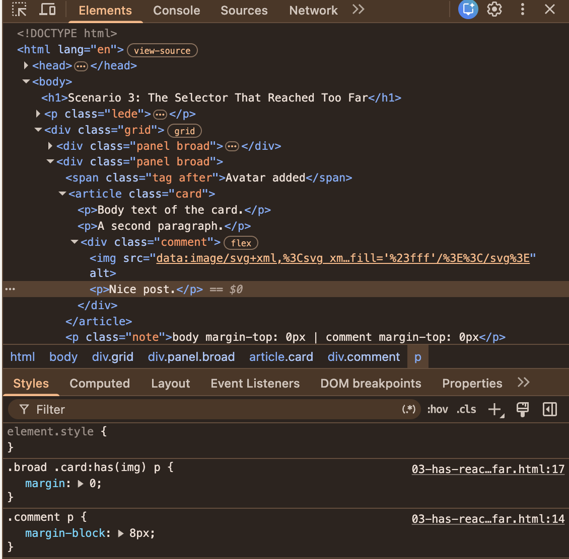
:has(img) style attached. (Large preview)- The selector matches more than we meant.
The:has(img)rule matches any descendant image, so the comment’s avatar counted as a hero image. And thepelement selector matches any descendant paragraph. As a result, the comment’s text was caught in the selection. - The selector outweighed the comment’s own rule.
MDN’s specificity guide explains that:has()adds no weight by itself, but its argument does. That gives.card:has(img) pa specificity score of 0-1-2, while.comment pcomes in at just 0-1-1 and loses the battle.
It could get even more complex and difficult to catch because the state changes at runtime. Let’s say a user posts a comment that includes an avatar. The body text of the card above it loses its spacing. Good luck reproducing that from a bug report that says “spacing looks off sometimes.”
The fix is to constrain the selector with child combinators:
.card:has(> img) > p {
  margin: 0;
}
This helps the selector get more specific about what it is yelling about.
Nesting Also Borrows Weight
Native nesting has the same habit. MDN’s guide to nesting and specificity says the & selector takes “the largest specificity in the associated selector list,” exactly like :is(). Look at this adaptation of MDN’s example:
/* Specificity 1-0-0 */
.card, #featured {
  /* Specificity: 1-0-1 */
  & a {
    color: blue;
  }
}

/* Specificity: 0-1-0 */
.button {
  color: red;
}
A .button link inside a .card is blue, even though the #featured ID is nowhere near it. The usual reaction is a more specific .button rule, then an exception to that rule. Before you know it, you are in a war of specificity you never knew you had declared.
The way out is to keep the selector list and drop its weight by wrapping it in :where():
/* :where() always weighs 0-0-0 */
:where(.card, #featured) {
  /* Specificity: 0-0-1 */
  & a {
    color: blue;
  }
}

/* Specificity: 0-1-0 */
.button {
  color: red;
}
Plain links inside a card are still blue, and the .button link is red again. Again, another way to quiet the loud housemate.
Layers Don’t Rescue You By Default
Don’t be fooled into thinking specificity is the whole story. MDN’s introduction to the cascade puts origin, importance, and cascade layers ahead of specificity, and notes that “normal layered styles have less precedence than normal unlayered styles.” In my test, a layered rule with a specificity of 0-4-0 lost to an unlayered .title (0-1-0). So if your new component styles go into @layer components while the legacy stylesheet stays unlayered, the legacy rule wins every conflict, however carefully you wrote the new one. The exception is when the !important keyword is used, because it actually reverses the cascade order.
Miriam Suzanne’s original proposal for cascade layers describes exactly the pain layers were meant to remove: having to “be very careful with matching specificity to layer.” Layers do remove it, but only when the rules on both sides of the conflict are layered. A half-layered codebase just gives you one more ordering to keep in your head.
An Old Fight With A New Tool
None of these battles started with :has() or nesting. In an r/webdev thread titled “CSS-in-JS: What’s the biggest performance drop you actually felt?”, one of the most upvoted answers isn’t about performance at all. It is about the cascade:
“Here’s a fun one: refactoring your JS can cause your CSS to break, because your CSS builds are determined by JS import orders.”
— mq2thez
This is about the “order of appearance,” which is the last step in the cascade that ends up deciding a conflict nobody knew existed. Another commenter in the subreddit adds that the injected styles can land in a different order in development and production builds: “Who doesn’t love debugging something that works locally but not in prod.”
Not everyone in the thread agrees on who is to blame. TheThirdRace replies, “It’s a coding issue, not a technology issue.”
I think both are right, and that is exactly the point. CSS-in-JS is a different technology from the native features we are looking at, so take this as a neighboring example, not as proof. But the shape of the problem is the same: the tool did what it promised, and the trouble arose from how it complied with the existing rules.
Before you add the rule:
- Constrain it. Use
>so the selector stops at the component’s own children. - Drop the borrowed weight. Wrap heavy selectors in
:where(), which always has a specificity of0-0-0. - Check the layers. Which layer does your rule land in, and where do its competitors live?
Scenario 4: The Housemate That’s Slow To Pay Rent
“We moved it to CSS, so it’s faster now.” You have probably heard this in a code review, and maybe said it yourself. In my last article, I warned that it isn’t always the case. Let’s test it.
Moving a behavior from JavaScript to CSS changes who does the work. It doesn’t tell you how much work there is. The last housemate, the browser’s rendering engine, is the one who gets the bill. Everyone in the apartment shares it, and nobody looks at it after the move.
Take :has() as an example. Browser vendors were worried about its cost from the start. In a CSS Working Group issue about :has() restrictions, Emilio Cobos Álvarez noted that implementations wanted to ship it with limitations “in order to prevent performance footguns and complexity.” Today, MDN’s :has() page has a whole section on performance with two pieces of advice:
- Don’t anchor
:has()to an element with a large subtree, “likebody,:root, or*.” - Constrain the inner selector with
>or+, because otherwise “the browser might need to traverse the entire subtree of the anchor element on every DOM mutation.”
I wanted numbers, so I built a list with 5,000 rows. The test toggles an .is-selected class on the same row 300 times, so the row’s selected state changes on every toggle, and forces a style and layout update each time. I ran it in Chrome 153 on a Mac in October 2026, and recorded a trace in DevTools to count how many elements each toggle restyles.
See the Pen [Scenario 4: The Rewrite Nobody Measured [forked]](https://codepen.io/smashingmag/pen/XJMxVgP) by Shoyombo Gabriel Ayomide.
| Rule | What is in the stylesheet | Median time per toggle | Elements restyled |
|---|---|---|---|
| 1 | JavaScript toggles a class on the toolbar | Under 0.1ms | 1 |
| 2 | body:has(.row.is-selected) .toolbar |
About 1.4ms | 1 |
| 3 | .list:has(.cell > b) .row, with the toolbar handled by JavaScript |
Under 0.1ms | 1 |
| 4 | Rules 2 and 3 together | About 7ms | 5,001 |
| 5 | For scale: JavaScript restyles all 5,000 rows on every toggle | About 6ms | 5,001 |
There are two lessons in that table.
First, the “bad” selector was fine. Rule 2 is exactly the shape MDN warns against: a :has() anchored to body. It cost about a millisecond and a half more than the script, and it restyled a single element, the toolbar. A frame at 60Hz lasts 16.7ms, so I would take that trade for deleting an event handler any day.
Second, two harmless rules were not harmless together. Rule 3 styles the rows, and its :has() condition remains unchanged throughout the test. On its own, it costs nothing measurable. Put it in the same stylesheet as the second rule instead, and every toggle restyles all 5,000 rows plus the toolbar. That is about what it costs a script to restyle every row on purpose.
Let’s keep this in proportion. Since 7ms still fits inside a frame, nobody would notice it on this page. However, the browser is now restyling 5,001 elements to change just one, and neither rule says so. Also, the cost grows with the list. When I set the demo to 20,000 rows, the two rules together restyled 20,001 elements and took about 31ms per toggle, which is nearly two frames.
I can tell you what Chrome does here, but not why. Changing .is-selected on one row restyles every element that the other :has() rule targets, even though that rule never mentions .is-selected and its result never changes. I have filed this with the Chromium team as an issue, with a reduced test case, and I only tested Chrome. Whatever the cause, neither rule looks suspicious in a code review, and the cost applies only when both are met.
That is system complexity in a single table. And please take the pattern from it, not the numbers: this is one page, one browser, and one machine.
The same goes for animation. The animation guide on web.dev recommends restricting animations to opacity and transform where possible, and warns that “an animation that moves an element using something other than transform is likely to be slow.” MDN’s CSS performance guide lists the properties that trigger layout when animated, such as width, height, margin, top, and left. A CSS transition on left runs layout on every frame, while a JavaScript animation of transform skips it. The property determines the cost, regardless of which language you write it in.
To be fair, CSS often wins. A script that reads layout, writes styles, and reads layout again forces the browser to do layout several times in one frame, and a container query hands that whole job to the browser. But that win is something you can measure, so measure it:
- Record the interaction in the “Performance” panel of Chrome DevTools, before and after the change.
- Compare the time spent in “Recalculate Style,” “Layout,” and “Paint.”
- Enable CSS selector stats in the panel’s settings to see which selectors cost the most.
- Use production-sized data. A 20-row fixture hides what a 5,000-row list reveals.
When All Four Show Up In One Pull Request
Each of these scenarios is small on its own. The trouble is that a real migration could hit all four scenarios at once. You have already seen three of them. They are the three bugs in the “after” demo at the top of this article. Add a long list, and you get the fourth. One move-in, four housemates disturbed.
A team replaces a card’s JavaScript-driven responsive layout with a container query and :has(). The pull request adds twelve lines of CSS, deletes one script, and misses another. Within a month, three bug reports land, and there’s a chance a performance trace turns up as the fourth problem:
- The card title is too big on tablets. The observer still sets
.card--wide, and one rule still reads it. The developer goes digging through the JavaScript. - The cards on the dashboard have disappeared. On the dashboard, the card is a flex item, and inline-size containment collapsed it to
0px. The developer reads the parent’s layout. - The text is squashed in some cards. Those cards have comments with avatars, so
.card:has(img) pmatches. The developer traces the winning declaration in DevTools. - Selecting a row might become laggy for our biggest customer. At 5,000 rows, the two
:has()rules cost about 7ms per selection. That fits within a frame, even though each selection restyles 5,001 elements, whereas it used to restyle one. As the number of rows increases, the elements restyled increase, and the cost of the two:has()rules per selection will also increase, but who renders a table with a large number of rows without pagination?
None of these reports means that container queries or :has() were the wrong choice. Each bug lives in the meeting point between the new CSS and the system it moved into. Still, one small pull request has sent a developer through the JavaScript, the page layout, the cascade, and the profiler.
And the way out is not a return to JavaScript. Here is the same page once more, fixed.
See the Pen [demo (fixed PR) [forked]](https://codepen.io/smashingmag/pen/wBJYpPJ) by Shoyombo Gabriel Ayomide.
It still uses a container query and :has(), with three changes:
- The observer and the leftover
.card--widerule are removed, so the layout has a single owner. - The query container is a wrapper that inherits its width from the surrounding layout, so the card can no longer collapse.
- The selector is constrained to the card’s own image and its own paragraphs, so the comment keeps its spacing.
This gap between a clean start and a real codebase shows up in the same r/webdev thread. The person who started it, JRM_Insights, opens with an observation that could describe any of our four scenarios:
“I often find that the initial tooling simplicity gives way to harder-to-debug runtime styling issues.”
— JRM_Insights
Further down, mq2thez describes moving an old CSS-in-JS codebase to a newer pattern: “In isolation or greenfield maybe it wouldn’t be a huge issue,” but in practice, it meant rewriting “whole component trees.” TheThirdRace, who had been defending the technology, answers that they had only ever evaluated it “from a greenfield project perspective,” and that it was “very enlightening to see this through the lens of a spaghetti CSS migration.”
That is the honest version of this whole article.
Your Migration Checklist
Before you replace JavaScript with a modern CSS feature, or adopt one in an existing codebase, answer these six questions. Think of them as the conversation to have with the housemates before the new tenant gets a key. I suggest putting the answers right in the pull request description.
- Ownership: Is exactly one of CSS or JavaScript the owner of this behavior?
- Scope: What changes for the element’s formatting context: its width, its parent, its children, and its neighbors?
- Cascade: Which existing rules could override this one, and which rules could it override?
- Migration: Have you deleted the old implementation, including every class and selector it relied on, and tested every state?
- Performance: Have you measured the real workload before and after, rather than assuming the rewrite is faster?
- Maintainability: Can the next developer tell why this rule exists and where its effects stop?
Conclusion
Modern CSS is great and a huge improvement to styling as a whole. In particular, container queries and :has() let us express things that used to need a script, a dependency, or a hack. But a new capability does not hand us a simpler system by default. In every scenario we looked at, the new tenant did something that didn’t sit well with others, and that was because nobody introduced them to the housemates’ ways of doing things. We get a simpler system when the new rule has one clear owner, a scope we have checked, a place in the cascade we chose on purpose, and numbers showing it helped.
So, the next time a pull request deletes more than it adds, enjoy the red lines. Then ask where the complexity went, and run the six questions. If you can’t answer one of them, the migration isn’t finished yet.
References

(gg, yk)